
A thread similar to this thread about Pr1SnesLevEd.
SDLPoP currently has no icon.
Would it be nice if it had one?
Attached a first idea.
SDLPoP icon?
SDLPoP icon?
- Attachments
-
- SDLPoP icon idea
- icon.png (10.22 KiB) Viewed 7627 times
Re: SDLPoP icon?
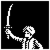
Different idea, with text.
Several variants, the location of the sword and the size of the handle are different for each one.
Several variants, the location of the sword and the size of the handle are different for each one.
- Attachments
-
- SDLPoP icon idea
- SDLPoP_icon.png (1.44 KiB) Viewed 7621 times
-
doppelganger

- Vizier

- Posts: 119
- Joined: April 24th, 2015, 9:04 am
- Location: India
Re: SDLPoP icon?
I'd vote for the first one from the left on the second row.Norbert wrote:Different idea, with text.
Several variants, the location of the sword and the size of the handle are different for each one.
Re: SDLPoP icon?
Hm, you know what might be possible... to combine those two icon ideas (the palm tree, the text with sword).
I'll try to combine them as two layers, with various modes.
Might work and look good, might completely fail. If it works, I'll post the results in this thread.
I'll try to combine them as two layers, with various modes.
Might work and look good, might completely fail. If it works, I'll post the results in this thread.
Re: SDLPoP icon?
Looks like that doesn't work.
The tiny palm tree just isn't recognizable enough.
All it does is mess up the text.
The tiny palm tree just isn't recognizable enough.
All it does is mess up the text.
- Attachments
-
- Didn't work.
- combined.png (1.49 KiB) Viewed 7577 times


Re: SDLPoP icon?
Here is my idea 
- Icon.jpg (58.37 KiB) Viewed 7548 times
Re: SDLPoP icon?
Attached, yaqxsw's idea as 16x16 and 32x32 icons.
- Attachments
-
- gear icon
- gear_icon.png (636 Bytes) Viewed 7543 times

Re: SDLPoP icon?
Nice ideas!
Here's how the icons would look:
Here's how the icons would look:
- Attachments
-
- SDLPoP_icon_exe.png (1.08 KiB) Viewed 7495 times
-
- SDLPoP_icon_window.png (1.24 KiB) Viewed 7495 times
-
- gear_window.png (1.05 KiB) Viewed 7495 times
-
- gear_exe.png (1.09 KiB) Viewed 7495 times
Re: SDLPoP icon?
I think, first icon is betterNice ideas!
Here's how the icons would look:
Re: SDLPoP icon?
Hm, not an entirely 'fair' comparison though.Falcury wrote:Nice ideas!
Here's how the icons would look:
You made the background for one transparent, but not for the other.
If the white background is included for the gear icon, it looks much better.
Re: SDLPoP icon?
I've decided to use that palm tree icon for my new savof tool.Norbert wrote:Attached a first idea.
Re: SDLPoP icon?
Added the gears icon: https://github.com/NagyD/SDLPoP/commit/ ... 49d4b5450d
I'm not fully sure if this will be the final icon, though...
There is also a related issue: "Provide icon and .desktop file": https://github.com/NagyD/SDLPoP/issues/103
I'm not fully sure if this will be the final icon, though...
There is also a related issue: "Provide icon and .desktop file": https://github.com/NagyD/SDLPoP/issues/103
Re: SDLPoP icon?
We now have a forum image (based on the gears icon) for the SDLPoP board (Thanks, Norbert!)
Re: SDLPoP icon?
Maybe something can be done with / derived from the Prince of Persia 1 for Mac icon?David wrote:I'm not fully sure if this will be the final icon, though...
Just for fun, I tried to recolor the icon image that I downloaded from popot.org (I only changed the colors of the palette). I'm not too sure about the result... It's not really distinctive from the original except that the building is pale yellow instead of gray-bluish, and the red stripe became a bit more purplish.
- Attachments
-
- Prince_of_Persia_1_Mac_icon_recolor.png (903 Bytes) Viewed 7217 times
Re: SDLPoP icon?
One question is, do you want it to look good at 16x16. Website favicons are frequently displayed as 16x16. Taskbar icons often have the same or a similarly small size. This is why I personally always design icons as 16x16 images, and then scale them with no interpolation to 32x32 where necessary/appropriate. The palm tree, text+sword and gear icons in this thread, for example, all look sharp even at 16x16. I did the same with my relevant suggestions for Pr1SnesLevEd, such as the prince. I think the sworded prince also looks great at 16x16, a very nice program icon. If you look at the stairs there, these are also based on the 16x16 image. David eventually picked one of the yellow stairs, but a 32x32 variant (not 16x16 scaled up), which - at least on my system - makes the program icon on its title bar less crisp than it could be. Then again, times change and 16x16 is very small on today's screens. Since a bit more than a week, the (HTML5) validator of the World Wide Web Consortium (W3C) no longer accepts the favicon shortcut, and <link rel="icon"> is now used with "sizes" all the way up to 256x256 and possibly even higher. Desktop icons are also larger, of course. I'm old school though. If you check the VR on Linux icon on the browser tab; good stuff. Plus with Prince of Persia... We deal with pixely things a lot. Maybe big pixels are a good fit. They have a charm on their own. Then again, SDLPoP is a modernization of the old game. Simplicity also matters for good logo design, which means starting with 16x16 could help force the creator keep things simple. Hm, this is starting to become a block of text.Falcury wrote:Maybe something can be done with / derived from the Prince of Persia 1 for Mac icon?David wrote:I'm not fully sure if this will be the final icon, though...
Just for fun, I tried to recolor the icon image that I downloaded from popot.org (I only changed the colors of the palette). I'm not too sure about the result... It's not really distinctive from the original except that the building is pale yellow instead of gray-bluish, and the red stripe became a bit more purplish.
Another question, does the Mac icon, the mausoleum, 'say' SDLPoP? The VR on Linux icon linked above shows the head of the Linux mascot wearing a head-mounted display. The SDLPoP icon with text literally says SDLPoP. The gear icon by yaqxsw shows the head of the PoP1 for DOS prince with gears. The gears remind me of customization and - even more so - of being able to see how something operates. The icon tells me SDLPoP has opened up PoP1 for DOS to see how it ticks and runs. Those big gears in his draft are probably from an existing (stock) image, but as a small icon it's really not bad.